Dawgs design CDC’s COVID-19 graphic
For Dan Higgins (BFA ’93) and Alissa Eckert (BFA ’04), their days sheltering in place aren’t that different than those of their friends and neighbors in Atlanta or for their fellow Dawgs throughout the Bulldog Nation. They are balancing teleworking with homeschooling children and calming older relatives they can no longer visit. For Dan, that means creating a ballet studio where the sofa once sat. For Alissa, it means becoming a kindergarten and third grade teacher. What does set them apart is that they also make time for interviews with The New York Times. That’s because this dynamic duo created the ominous image of the COVID-19 virus that appears on nearly every news broadcast, in countless publications, internet outlets and splashed across social media feeds.
You see, in addition to being University of Georgia Franklin College of Arts and Sciences Lamar Dodd School of Art alumni, Dan and Alissa are medical illustrators with the Centers for Disease Control and Prevention (CDC) in Atlanta. Alissa remembers receiving a phone call on a Tuesday in January. A new virus that originated in China was spreading rapidly and the public needed to understand the gravity of the situation. An arresting visual would give the virus a face, making tangible something people can’t see with the naked eye. Dan and Alissa worked together to research and pose questions to the subject matter experts in the lab at the CDC. Armed with that information, Dan jumped on the World Protein Data Bank and downloaded images of each of the three main proteins that make up the virus. Pulling those files into a data visualization tool, he was able to export them as three-dimensional (3D) images.

Process of turning the S protein from the World Protein Data Bank into a 3D image. (Alissa Eckert, Dan Higgins/CDC)
It was Alissa who combined those pieces together to begin to form the image that is so familiar today. With input from CDC scientists, they identified how many of each protein to show, how the spatial distancing should appear and where the lighting should come from in order to establish the proper depths. Dan and Alissa muted the colors to convey the seriousness of the situation. They were careful not to make the virus look playful.
As Alissa explains, “We didn’t want it to look like a toy.”
They created a high contrast image with strong details and textures, elements that bring the virus to life and make it seem real and touchable. After an intense seven straight days of work, the pair finalized the now-famous image for approvals on the following Monday morning.
Since then, they have animated the virus image, creating a version that rotates in hopes of giving it more life. They have also lent their talents to symptom illustrations and the creation of graphics for social media to further help the public understand the virus and its impact. [Two PDF fliers – Prevention & Symptoms] During an outbreak, it’s an all-hands-on-deck situation that finds Dan and Alissa alternating with others on their team to be on call for evening and weekends.
The Dawg Squad
Speaking of their team, it’s a group of eight members (six medical illustrators and two non-medical illustrators), five of whom are UGA alumni. Alissa explains that the world of medical illustration is a small one. A master’s degree in medical illustration is only offered by three accredited medical universities in the United States, and one in Canada. The path for many begins with the University of Georgia, specifically in the Lamar Dodd School of Art.
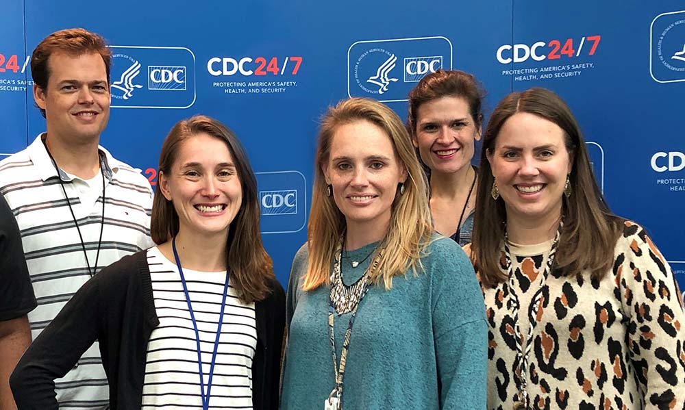
The CDC Dawg Squad of scientific/medical visualization experts – Front row: Stephanie Pfeiffer Rossow (BSA ’13), Alissa Hogan Eckert (BFA ’04), Jennifer Hulsey Oosthuizen (BFA ’05); Back Row: Dan Higgins (BFA ’93), Meredith Boyter Newlove (BFA ’04) (photo provided by Dan Higgins)
The UGA Connection
When Dan and Alissa attended the University of Georgia, the art school was in the mid-century modern building that now houses the College of Environment + Design on North Campus. (The art school’s main building is now located on East Campus.) Although they graduated more than a decade apart, they both reminiscence about late nights in the studio and walking through North Campus to go downtown to the art store.
Dan always had a passion for art and science. He took many undergraduate sciences courses and majored in graphic design through the art school, which wasn’t named for Lamar Dodd until 1996. He said his graphic design coursework prepared him for his role at the CDC because of its emphasis on layout and design to tell a story. His advice for students who wish to pursue a career like his? Pair graphic design courses with medical illustration to better understand the importance of establishing a hierarchy to the flow of information and learn how to lead the eye to help convey a story. He mentions Alex Murawski as a UGA professor who had a positive impact on him. After UGA, Dan enrolled at the University of Illinois in Chicago to pursue a Master in Biomedical Visualization. There, he took art classes, of course, but also courses like Gross Anatomy and Physiology alongside medical students.
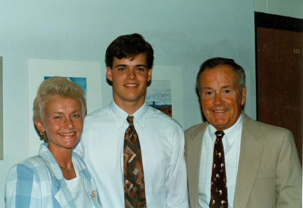
Dan with his parents at the UGA Art School’s Graphic Design Show his senior year in 1993. (photo provided by Dan Higgins)
Alissa majored in scientific illustration at UGA. She cites professor Gene Wright as a major influence in her time at Lamar Dodd. She credits the program with preparing her for graduate school and her eventual career at the CDC by emphasizing professionalism, presentation skills and directed studies that required hands-on work. She began at the CDC in 2006, right after completing her master’s degree in medical illustration from Medical College of Georgia. Her advice for anyone who wants to follow in her path? Get a background in both traditional and digital arts and become adept in two- and three-dimensional animation.
Dan and Alissa have worked together for 14 years. They sit across from one another at the CDC and collaborate on many projects, although it is rare that their images are turned around as fast as the COVID-19 one—or garner as much international attention.
In an email exchange, Lamar Dodd’s Kate Arnold conveyed to Alissa that the iconic image is now burned into her consciousness. She says she pictures it when deciding whether to touch something in the grocery store. Alissa loved hearing that. “That’s a perfect example of why we do this,” she says.
Asked if there was one message they would like to get out to the Bulldog Nation, Alissa said, “Hunker Down. Wait it out.” Dan adds, “Staying home is the most important thing.”
COVID-19 Insights
The Goal is Education
Helping people visualize the virus isn’t so much about accurately representing what it would look like under a microscope, but more about conveying why it is dangerous.
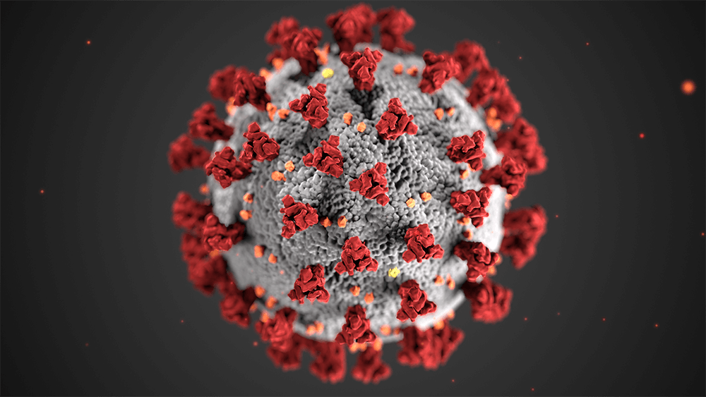
The virus can’t reproduce on its own. The virus hijacks healthy host cells, and it is these pirated cells that reproduce the virus. The image is intended to visually explain how that occurs.
Spike or S proteins – these are the spikey red protrusions in the image. These clumps of proteins attach the virus onto the host cell. It is these spikes that create the halo, or corona, around the virus. Alissa and Dan decided to highlight the S protein with the red color and plentiful number in the image because the barbs best communicate how the virus latches onto a healthy cell.
Envelope or E Proteins – these are the yellow specks in the image. They represent the smallest of the three main proteins that make up the virus. It is these proteins that channel through the membrane to gain access into the healthy cell.
Membrane or M Proteins – these are the orange crumbs in the image. They are the most abundant of the three proteins, they give form to the virus. This protein fuses with the membrane of the healthy cell.
Body – the gray surface in the image. This represents the envelope that surrounds the nucleus of the virus. Dan and Alissa decided to create a shadowy, highly textured surface that almost invites touch. Implying a tactile experience helps an abstract concept seem more concrete.
The most important thing to know about the virus is that it cannot spread on its own. People spread it.
Visit the CDC website to learn more. Discover more about UGA’s role in battling COVID-19, and visit UGA’s COVID-19 Information and Resources page to access a wealth of information gathered in one place.



 Kelly Sikkema via Unsplash


